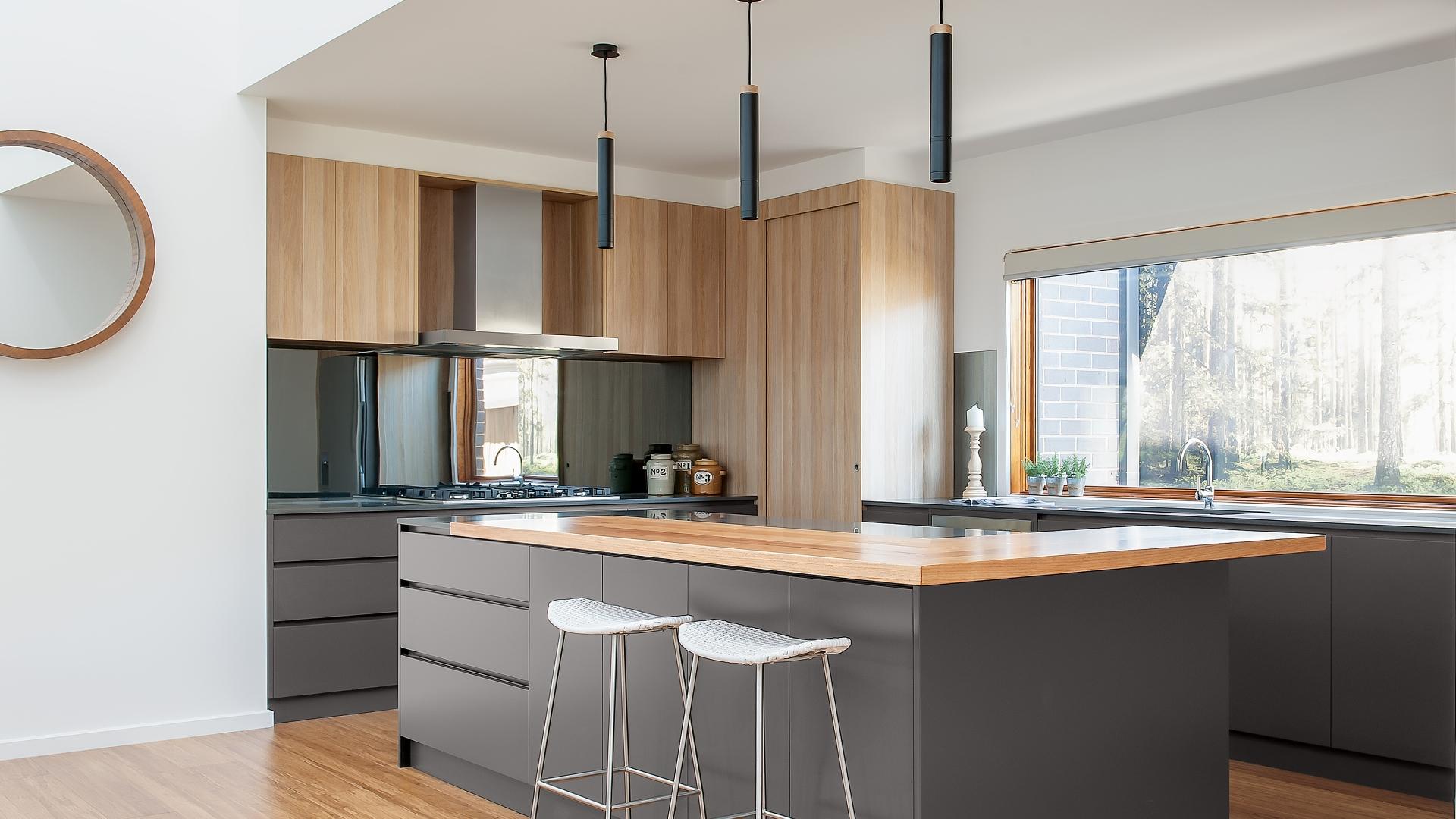
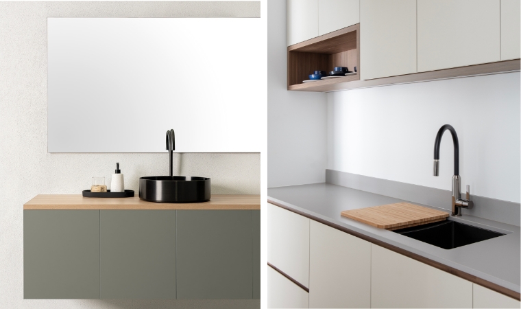
Colourpyne’s curated selection of solid colours has been carefully developed to offer a versatile and lasting aesthetic for interior spaces. These colours are designed to complement a variety of styles and applications, from residential kitchens to commercial workspaces. Each shade has been chosen for its ability to bring character, balance, and depth to a space while maintaining a timeless quality. Whether you prefer soft neutrals, more dramatic hues or something rich, this range provides options that enhance both function and form.
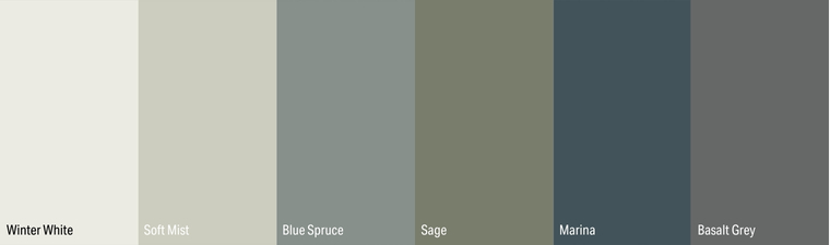
Winter White: The Modern Neutral
White continues to reign as a staple in design, but not all whites are created equal. Colourpyne’s Winter White introduces a subtle grey undertone that elevates it beyond a traditional crisp white. This refined shade maintains a clean and sophisticated presence while offering versatility in pairing with both darker and lighter tones. Perfect for:
- Contemporary and minimalist interiors
- Creating a fresh, airy ambiance
- Pairing with bold accents for contrast
Soft Mist: A Whisper of Green
For those looking to introduce a delicate touch of colour without overwhelming a space, Soft Mist offers the perfect solution. This pale green-inspired shade is soft, soothing, and effortlessly refreshing. Its light tone brings a sense of calm and openness, making it a great choice for tranquil interiors. Perfect for:
- Calm and relaxing environments
- Enhancing natural light in interiors
- Pairing with timber or white for a soft, organic feel
Blue Spruce: The Tranquil Statement
Blues and greens are a staple in modern colour trends, and Blue Spruce masterfully blends both. With a fusion of light blue and subtle grey-green undertones, this sophisticated shade offers a sense of peace and depth. It’s versatile enough to stand alone as a feature or work harmoniously within a muted palette. Perfect for:
- Adding depth to modern interiors
- Pairing with natural elements like wood and stone
- Bringing a cool, serene atmosphere to workspaces and homes
Sage: A Fresh Take on Green
Green remains one of the most sought-after colours in interior design, and Sage continues this trend with its warm, earthy tones. This muted green with yellow undertones offers a sense of vitality and harmony, making it an excellent choice for contemporary and traditional spaces alike. Perfect for:
- Creating a connection to nature indoors
- Pairing with natural materials for a timeless look
- Adding warmth to minimalist and Scandinavian-inspired designs
Marina: The Coastal Escape
For those drawn to deeper, moodier tones, Marina offers a rich teal-blue hue infused with subtle grey undertones. This shade evokes the calming essence of the ocean while maintaining a level of sophistication that works well in both modern and classic interiors. Perfect for:
- Feature walls and bold cabinetry
- Adding depth and vibrancy to muted palettes
- Pairing with metallic accents for a luxe aesthetic
Basalt Grey: The Moody Neutral
Neutrals continue to dominate modern design, but there’s an increasing shift towards deeper, more character-filled greys. Basalt Grey is a rich, moody shade with blue undertones that adds a contemporary edge to interiors. Its depth makes it a sophisticated alternative to traditional greys. Perfect for:
- Creating a dramatic yet elegant look
- Pairing with crisp whites or warm timber tones
- Enhancing industrial and modern aesthetics
Designed to Stand the Test of Time
Colourpyne’s new solid colours are designed to provide enduring appeal and flexibility, ensuring they remain relevant across different design applications. Whether used for cabinetry, wall panelling, furniture, or commercial interiors, these shades offer:
- Timeless Versatility – Designed to complement a range of materials, styles, and finishes.
- Balanced Tones – Carefully curated hues that enhance spaces without overpowering them.
- Durability and Practicality – Aesthetic appeal combined with the resilience of decorative laminate boards.
Each colour in this range has been developed to enhance interiors in a way that remains fresh and adaptable, no matter how design preferences evolve over time.
Elevate Your Interiors with Colourpyne’s New Colours
With this new range of solid colours, Colourpyne offers a palette that meets the needs of both residential and commercial spaces. Whether you’re looking to create a serene, neutral backdrop or introduce a bold accent, these shades provide the perfect foundation for stylish and functional interiors.
To explore these colours in person, simply order a sample or visit your nearest Colourpyne distributor and discover how they can bring your design vision to life.